
Mortgage Broker Website: A Blend of Personality and Usability
When Joanna approached me about revamping her mortgage broker website, it was clear she wasn’t just looking for a fresh coat of paint. She wanted a site that felt like her—warm, reassuring, professional, and clear.
Her existing site had all the right information, but it lacked personality, and for clients navigating one of the biggest financial decisions of their lives, tone and trust are everything.

Understanding Joanna’s Vision
The first step was getting to know Joanna’s personal brand. She has a calm, approachable presence—someone you immediately feel comfortable with—and that had to come through in the website. During our initial meetings, we talked less about tech and more about how she communicates with her clients, what kind of experience she wants them to have, and what makes her different from other brokers.
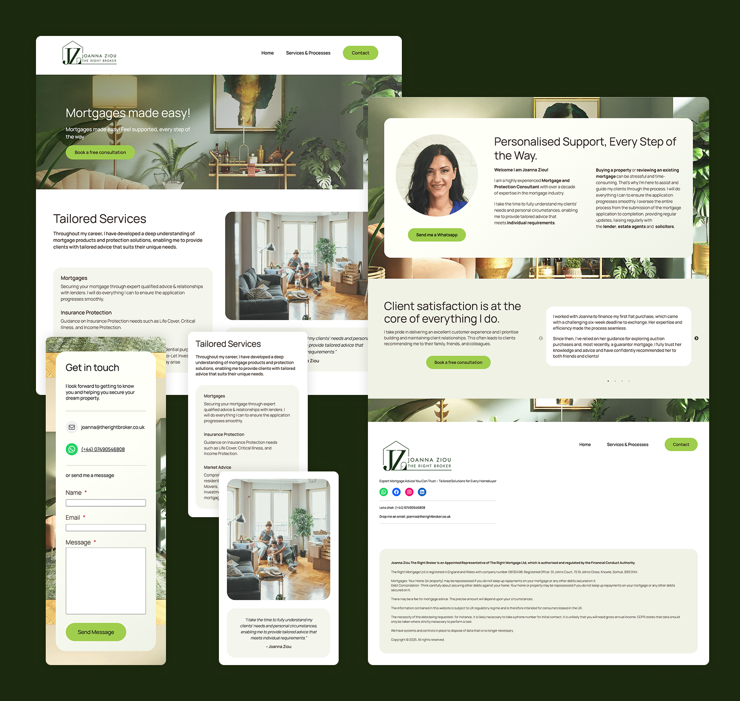
I also reviewed the site from a user’s perspective. While all the services were there, the navigation felt clunky and some content was buried too deep. The journey from landing on the site to actually contacting Joanna needed to be smoother and more intuitive.
Creating a Logo That Speaks to her clients
Alongside the website rebuild, I developed a new logo system to give Joanna a professional, cohesive brand identity. The design features both portrait and landscape variations to keep things flexible across digital and print use.
The logo itself is a subtle blend of two core elements: a stylised house, representing her work and what her clients are working toward, and her initial, woven into the structure. The result is a simple yet meaningful mark that feels personal, warm, and instantly relevant to her audience. It adds a layer of polish and professionalism while staying grounded in Joanna’s approachable brand.


Bringing in the Right Aesthetic and Voice
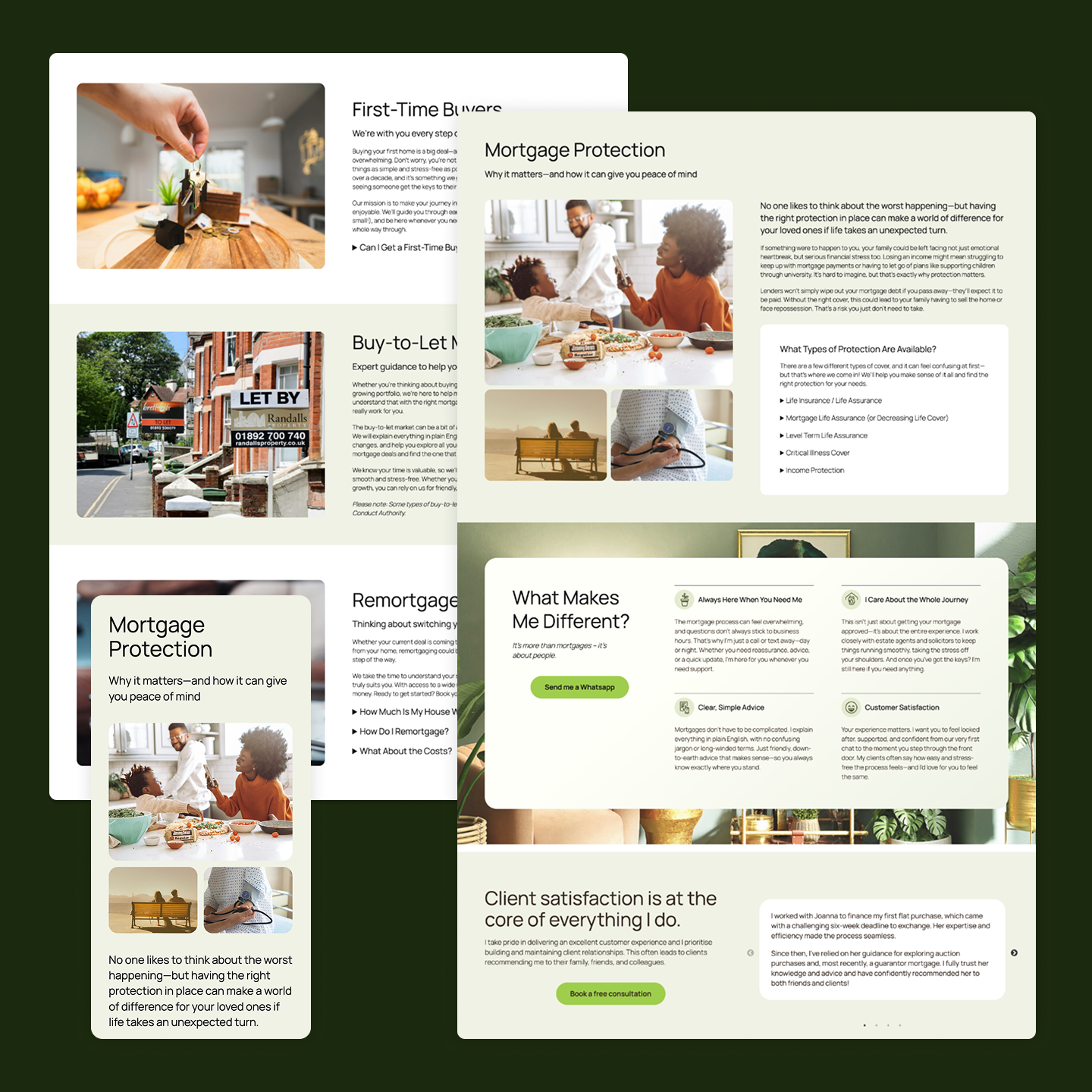
From the start, it was clear the site needed to move away from generic stock imagery and corporate copywriting. Joanna’s aesthetic is clean but cozy—think soft color palettes, personal photos, and gentle typography. We introduced warmer tones, white space, and subtle animations to keep things modern without losing that personal touch.
Copywriting was a big piece of the puzzle. We rewrote every section of the site using Joanna’s tone of voice: clear, kind, and jargon-free. Rather than pages that simply listed services, we focused on how she supports clients through each step of the mortgage process, using language that was friendly and easy to digest.
Designing a Smoother User Journey
A major part of the rebuild was rethinking the site’s structure. We streamlined the navigation and clarified the main call-to-actions, making it easier for visitors to understand what to do next—whether it was booking a consultation, reading up on the mortgage process, or simply getting to know Joanna better.
We also added a few thoughtful features to help guide users:
A “Start Here” page for first-time visitors.
FAQs written in Joanna’s own words.
A simplified contact form that feels like a conversation, not a chore.
The Result
The final product is a website that not only looks and feels like Joanna but also works better for her clients. It’s more than a marketing tool—it’s a true extension of her personality and the way she does business.
Clients now spend more time on the site, conversion rates have improved, and best of all, Joanna feels proud to share it. And for me, that’s the real win: creating a digital space that doesn’t just work, but feels right.

Have the same struggles with your website, drop me a message and lets discuss how we can work together!